Thursday, July 29, 2010

Jewelry takes people's minds off your wrinkles. ~ Sonja Henie


Inspired by my recent rash of abstract paintings, I thought of an idea that would allow me to apply the same type of unpredictability to jewellery. I came up with several ideas for One-of-a-Kind pieces. I am calling them ART TO GO Series 1 and Series 2. I now have  a total of fourteen pieces for Series 1, and am working on Series 2. here are some first examples from Series 1. They are called ART TO GO, because it is art you can wear on the go!

These are literally designed "in the air", and no two will ever be the same. Plus, they cannot be moulded due to the way they are made. In buying one of these, you truly will own a one-of-a-kind piece!


Some, like the one above, have several places that they can be hung by. In those cases, I have used a sterling snap-on bail, so that the purchaser can hang the piece how they most prefer it.


Some like the one directly above this writing, don't even need a bail, but if a person wants one, it will be provided. Again, this piece has numerous places from which to hang it, allowing you to completely change the look of the piece. 


There are a few that have built in bails, which I did while in the midst of designing them, like the one directly above.


And finally, some have soldered on bails, like the one directly above, and the next three pieces below.


The one directly above, and the next few have got the snap-on bails.


This one is flatter and less 3D than the others.

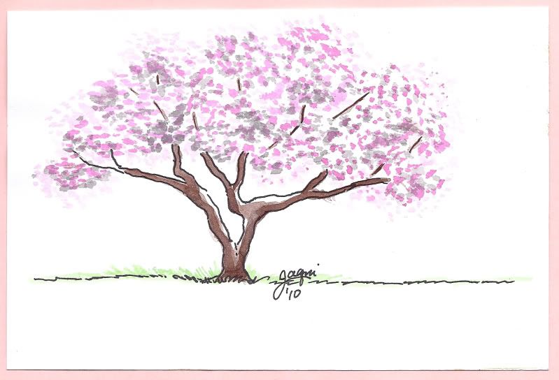
Coming soon: the same One-of-a-Kind concept applied to Tree of Life Pendants, and Series 2 of the ART TO GO sterling pendants.

Of course all of these are available at my Artfire store:


Monday, July 26, 2010

Winter is an etching, spring a watercolor, summer an oil painting and autumn a mosaic of them all. - Stanley Horowitz


One of the other projects we were asked to do was The Four Seasons. I had a great idea in mind, when we were then told that it should be a photo-collage. So, naturally, I did both. 

The first one is the first idea. I mounted all four paintings onto a canvas board. I was thinking about how time is cyclical, and so are the seasons. So, while I tried to make all four be paintings that could stand alone, I still wanted to mount them in such a way as to be reminiscent of a clock. At the top, Spring, then to the right, Summer, then to the bottom Fall, and finally to the left Winter. Each one holds elements of the season before and after, as there is a natural blending in the seasons. I do wish the plaster textures showed a bit more.


After that, I kept the clock in mind when doing the photo collage versions of the seasons. Since we were asked to use photos of people, I decided to make it "The Four Seasons of My Emotions", and used my own photo. I used the same photo for all four, distorting and altering the picture for my needs. I placed my photo in the appropriate position of the clock, keeping that these going.

So, First, we have Spring - Hope. I wanted to give the feeling of growth, so I splashed upward, and without realizing, made it quite flower-like. I did not alter the photo for this first one, as at the time that photo was taken, I was in a place in my life where I had a lot of hope. I then used colours that I felt were appropriate for Spring.


Next, we have Summer - Joy. Here I intentionally suggested a flower, and altered the photo to bring bright glowing colour to the background and myself. When I am in joy, I think of myself as "glowing", so it seemed appropriate. The photo is to the right, as if it were in the same place as the number 3 on a clock. I used colours that I felt were appropriate for Summer - lots of bright, flowery colours.


Next up is Fall - Doubt. Why doubt? Well, doubt is the opposite of hope, as fall is the opposite of Spring. I faded the picture of myself and used Photoshop to get the "negative" of it, because doubt is negative, and we fade away when we are in doubt. The photo is in the same position as the number 6 on the clock. I used colours that I felt were appropriate for Fall, reminiscent of the foliage at that time of year.


Then there is Winter - Despair. Again, the opposite of Joy, as Winter is the opposite of Summer. Here I really distorted the photo, turning the smile into a grimace of pain. I used wintery colours, and build up the plaster to create snow-like drifts. My picture is in the same position as the number 9 on the clock.


When I first presented these, a number of people said, "Wow, you really hate winter, don't you?"

While I admit to being a spring and summer girl, I really don't hate winter or fall all that much. I was really just thinking in opposites. The winters here in Toronto are not anywhere near as bad as they are in Montreal. So, ever since I moved here, I no longer cringe at the thought of winter. 

Saturday, July 24, 2010

I make no excuses for Abstract Expressionism, but some of it was 'splash and hope.' ~ Jack Madson

Time for more of the paintings I have been up to in recent weeks. Sorry it takes me a while to find the time to update the blog, but life is busy, so what can you do?

For the past couple of weeks, I have been working with the same techniques as before - pouring and throwing plaster and paint of the canvas. here are some of the results:


Glitter Wave, 8 x 10, acrylic & plater on canvas. The lighting for these paintings is a little bit difficult, as I have used metallic colours, iridescent colours , and even some glitter. These don't show as well in photos as they do in person. This one is very lively and the sparkles just light it up.


Caught in the rain, 8 x 10, acrylic and plaster on canvas. I just love the textures in this one, and the way the colours run together. I called it "Caught in the Rain" because as I looked at it once it was dry, I could see "people" in the dark purple at the bottom, and it looks to me like like they are running to get out of the rain.


Joy to the World, 8 x 10 acrylic and plaster on canvas. There is quite a bit more texture than you can see in this photo, as the painting is quiet 3D. It is very lively, energetic and joyful in the colouring.


Spirit Essence 1, 12 x 12, acrylic and plaster on canvas board. The lighting for these paintings is a little bit difficult, as I have used metallic gold, and even some glitter, just like the one above.  The great thing about this series is that there is no way to reproduce another exactly like this, so they are truly one of a kind.


Spirit Essence 2, 12 x 12, acrylic and plaster on canvas board. 


Firefly, 12 x 12, acrylic and plaster on canvas board.  I have used metallic colours, the pink, purple, blue are all iridescent and metallic colours. These don't show as well in photos as they do in person. Though I had not intentionally created a firefly, the shape started to suggest it as I was working, so I went with it, but loosely, and in a more abstract way. 


Cotton Candy, 6 x 8, acrylic and plaster on canvas. Another one using the sparkles, and iridescent colours, which unfortunately don't show up as well as I would like in the pictures.


Powerfull Pizzazz, 6 x 8, acrylic and plaster on canvas. This one is extremely full of energy and pizzazz!  I love the textures in this one as well.


The Midas Touch, 6 x 8, acrylic and plaster on canvas. This one takes a more literal turn compared to the others, and the picture is deceiving, in that it makes it appear like the hand is convex on the canvas, but it is instead concave. A LOAD of plaster is on this canvas making it quite heavy.

These are all of course available for purchase in my Artfire store:


I have lots of other new ideas and work that I have been busy with for the past few weeks, and I will do my best to update the blog sooner this time. Meantime, don't stand too still - there exists the very real possibility that you'll become a part of my next art project, covered with plaster and paint!


Thursday, July 15, 2010

Do not copy nature too much. Art is an abstraction. - Paul Gauguin

So, while I have been off galavanting around, I have been forming ideas, and paintings in my head. I came back from vacation just in time for a class about the Jackson Pollock style of painting, and this has been quite wonderfully freeing!

We were asked to do a series of four paintings, on either the Four Elements or the Four Seasons. I chose the elements, and then added a fifth element: Spirit.

We started off throwing some plaster onto the board first, then once it was dry the process of throwing, pouring and dripping the paint began. The first one I did turned out to be Earth. As I threw plaster onto the board, thought I didn't have any plans, I noticed that a handful of plaster smacked onto the boards, reminded me of the Andes that I had just come back from. Another glob of plaster which I stuck my thumb into, suddenly reminded me of the volcanoes of Peru. I poured the paint appropriately, and this was the result.

I wish some of the 3D effects could be seen n the photo, such as the golden jewel at the top left, the volcano at the bottom right, but I think you can see the overall effect.

Next I thought I would do Fire, and started the process again of building a giant volcano on the board, but once there was a ring of plaster formed, I decided that it felt more like a pool of Water, so I poured and coloured appropriately for that, and this was the result.


I really like this one, it is soothing, and yet not completely still.

Next up was Air. I painted a traditional sky then put the plaster as an overlay. Now, truth be told, once the plaster was on the board for this one, I would have loved to leave it just white with the background paint showing through, but I knew the assignment was to pour and throw paint, so I added the coulours in. The result is this, and I do like it very much.


The next one that I tackled was Fire. This turned out to be one of my favourites.  I love the spontaneity, the colours and even the joy in the piece. I love the yellows zipping across, like little sparks flying and popping in the fire.


Now with this one, I was smart enough to take a couple of detail pictures of the textures:


Finally, I did Spirit. For this one I first painted the background black, then added the plaster, and the paints. I do quite like this one - I would say it is my second favourite. Again, I have a couple of detail photos of the textures. I used a lot of metallic colours here, which are difficult to photograph, but again, I think you get the overall effect.


I have plans to do a series of these, in smaller sizes, and I have some new stuff to add to the painting to get the effects that I am after. this should be interesting. Soon also, I will update with a bunch of others that I did in this style, that were not part of any assignment. But first, in the coming week, I will update with the Four Seasons which I did after doing the Four Elements. Enjoy!

Tuesday, June 1, 2010

Hellooooooo, is anyone out there listening?

It's hard to keep on bloggin' when the silence is deafening, so by all means, please feel free to comment, or follow.


So for the past few weeks, I have been busily working away. I have been doing a lot of pen & ink drawings, which can mostly be seen here at my Artfire store: http://www.artfire.com/users/Jaqui  You may want to check it out, I have a number of pieces that are on sale until Friday of this week, at 25% off.


I did 2 commissioned pieces, both 4 x 6, both pen & ink. I had found some watercolour postcards, and I love the weight of the paper, and how it doesn't warp when using the pen & ink. So, now I have switched to a heavier paper for the 5 x 7's as well.


Here are the 2 commissioned pieces: 


This first one has an interesting story behind it. I was asked if I could be commissioned to do one for a couple of friends who were staying at a womans place for the weekend. They wanted to give her a gift, and I was happy to help with that. One of my two friends asked me what I was going to paint. I said I thought I'd do a tree, and she replied that yes, she liked the trees I've been doing. She asked what kind of tree, and I said my gut was telling me it should be an oak. She replied that yes, she likes the oak, because of the strength it has. When I was looking for reference photos, I found one with the sun shining through, and a little voice in my head said, this lady who is being gifted, needs hope, so I should do something like that. When I was done and showed it to my friend, she gasped and said how fantastic it was, but later an even more interesting story came back to me. It seemed, the giftee, needs a healing of some sort, and so indeed does need some hope. Later a third woman asked me how I did this. I started to reply, "You know, layers...." No, she wanted to know how I had decided on this picture, so I related the above story. She then told me that there was a special story with the lady who was being gifted. She wasn't allowed to tell me said story until after June 30th, because of some confidentiality issues, but she said, "What I will tell you is that the picture you have chosen to do, is a picture that shows exactly what this woman is going through, and you couldn't have chosen a more perfect picture." Cooooool! I love stories like that, and can't wait to hear the rest of it!


After seeing the first of these two pictures, another friend asked me if I would be painting more trees, and of course answered that I would be. She said she'd know the right one when I painted it.  This was the next one, and she loved it, so it became hers.

I have also been busy with my abstract class, and I am in the middle of a series of 4,  which I will show you once they are completed.

In the meantime, I promised pictures of the pottery that I did.


Fun to do, and not bad for my first time on the wheel since I was fourteen years old! What's that you asked? No, I'm a little older than 29.

Saturday, May 8, 2010

If you make pictures you are bound to be an abstract painter on some level. -George Green

This week, I started my latest class. This semesters class is about abstract painting. We started looking at the earliest abstract artists, so naturally, we looked at Cubism. Now, previously, about 30 years ago, I had a class that very briefly touched on the same subject, and we did 2 "cubist" paintings.  So, these first 2 paintings are from wayyy back then.


This first one works I think. It has a good feel to it. The next I don't think is as successful, and has less abstraction (at least to me).


Finally, we get to the one I did last Thursday in class. For this we were asked to keep it monochromatic, and I like this one quite a lot. The more I look at it, the more pleasing it is to my eye. I find myself exploring the textures and spaces, and my eye wanders over  and around it as if I'll discover something new, even though I painted it.


This sounds  like it's going to be a lot of fun, and I have some interesting ideas brewing, things to paint over the coming weeks. I may not be posting all that much as I also have a lot of traveling we'll be doing for business, but I'll keep up as much as possible, and hopefully you'll enjoy the posts. :)


Wednesday, April 28, 2010

A busy week, with lots of stuff to show you.


So, I finally got around to trying out some abstract ideas, based on the book I bought: 


"Painting Abstracts: Ideas, Projects and Techniques".


I really like the first one:


It's a 10 x 12 inch oil. I like the way it developed, from simple random straight lines, I suddenly felt like curving some, and from there it reminded me of waves, which I then chose to enhance a little, while keeping it abstract. I am calling this one "Rocking the Boat".

After that I did another, adapting the exercise in the book to work with the materials I wanted - oils.


This one is an 8 x 8 inch oil. I am not as fond of this one, though my kids both like it. I haven't come up with a name for it yet. My daughter suggested "The devils rainbow", which I kind of like. My son suggested "Last Nights Omelette", another friend suggested "Pizza Nebula", and finally another friend suggested "Cupcake with Sprinkles". Clearly, my friends are hungry.

It's been a busy week for me. Aside from my foray into abstraction, I did a little 10 x 10 inch oil of a toucan, which I called "Toucan Do Better Than One"


I touched on some acrylic work:


I also kept up a few little pen & inks:


And, finally, a little bit of pastel work on coloured stock:


Anyway, please feel free to leave a comment, or I'd even love a suggestion for a name for that orange abstract painting. I will see you soon enough with more paintings/drawings!

By the way, if you are interested in purchasing any of my works, you can do so through my Artfire studio Here